

CognitOps Product
Performance Pulse and KPI Dashboard from CognitOps
CognitOps Product Update – April 2024
As I teased in our March update, this month, we released a powerful tool in CognitOps Align to help warehouse and distribution center supervisors keep their warehouse operations on track: Performance Pulse for Today. This feature provides additional context for daily performance and makes the reasons for actual performance easier to understand.
With this metric added to our KPI Dashboard and Picking Dashboards, supervisors can more easily spot performance issues and address them before they turn into longer-term problems.
Performance Pulse for Today
In last month’s update, I showed how we give our customers visibility to labor productivity, utilization, and efficiency, with context of how current performance compares to the 7-day rolling average. In addition to these performance metrics, we have created a new metric called Performance Pulse, which combines the utilization and efficiency metrics to give a holistic view of worker efficacy. While a seven-day rolling average is a good baseline for initial context, every day is different, and performance varies for different reasons.
When we evaluated how to best give the operations team visibility to how the team is currently performing, we realized the 7-day average comparison didn’t capture the nuances of performance by day or by shift. We decided to create a new data science-based forecast that looks at the day of the week, staffing, and work volume to create baseline or target Performance Pulse, Utilization, and Efficiency value for each day and shift within a day.
By setting a performance expectation, providing the ability to quickly check performance against expectation, and drill down into Area, Zone, and worker performance against expectation, operations supervisors can more easily optimize daily performance and stay ahead of longer-term performance goals.
Performance Pulse for Today
KPI Dashboard
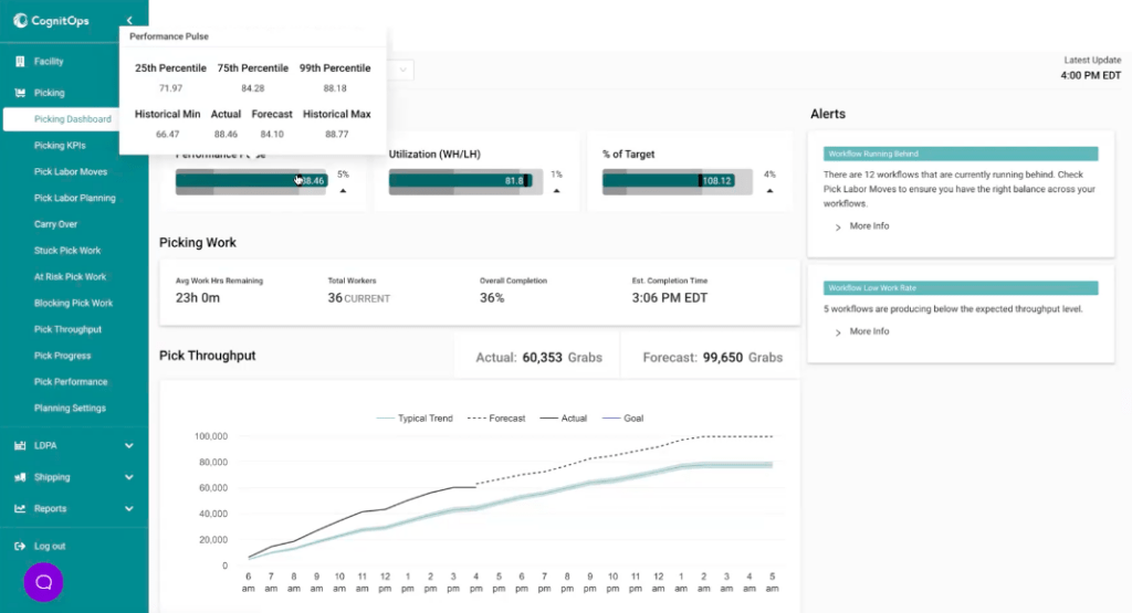
We pulled our new Performance Pulse for Today measure into our KPI Dashboard. At the moment, this dashboard is exclusively available in the Picking module but will soon be implemented across the Receiving, Inventory, and Shipping modules.
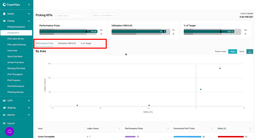
Here, we give the operations team quick visibility to all the Picking KPIs, including worker Performance Pulse, Utilization, and Efficiency (% of Target). This shows the current score and the performance we forecast for the day. Supervisors can see if teams are overperforming, underperforming, or right on track for the day compared to what we expected. They can also look at historical minimum, maximum, and 25th, 75th, and 99th percentile scores. If the team is overperforming, that’s great; leaders can give kudos to the team and tell them to keep it up. But if they’re underperforming, they can then drill into the details to find out who’s underperforming and where. This dashboard gives the ability to drill down to see where performance is good or bad for each of those KPIs by Parent Area, Area, and Zone.
Picking KPIs
Our Delta chart shows performance against expectation by the number of hours. Those to the right of 0 are overperforming, and those to the left are underperforming. By plotting this against the number of hours, leaders can evaluate the impact. If a team is underperforming, but the number of hours spent is low, it may be a seasonal aberration or may not be worth focusing on. This same information is also available in a tabular view. We also show the top and bottom ten workers, offering the opportunity for congratulations or coaching.
From here, supervisors can dive down a level to each Zone within an Area for more granular detail. Because Parent Areas, Areas, and Zones are split to maximize efficiency by the type of product being picked, the size of the orders, and more, it just makes sense that the expected target for each would be different. Workers are likely to pick cans of cat food faster than ATVs, so supervisors can see these performance measures discretely – again, providing relevant context to understand performance.
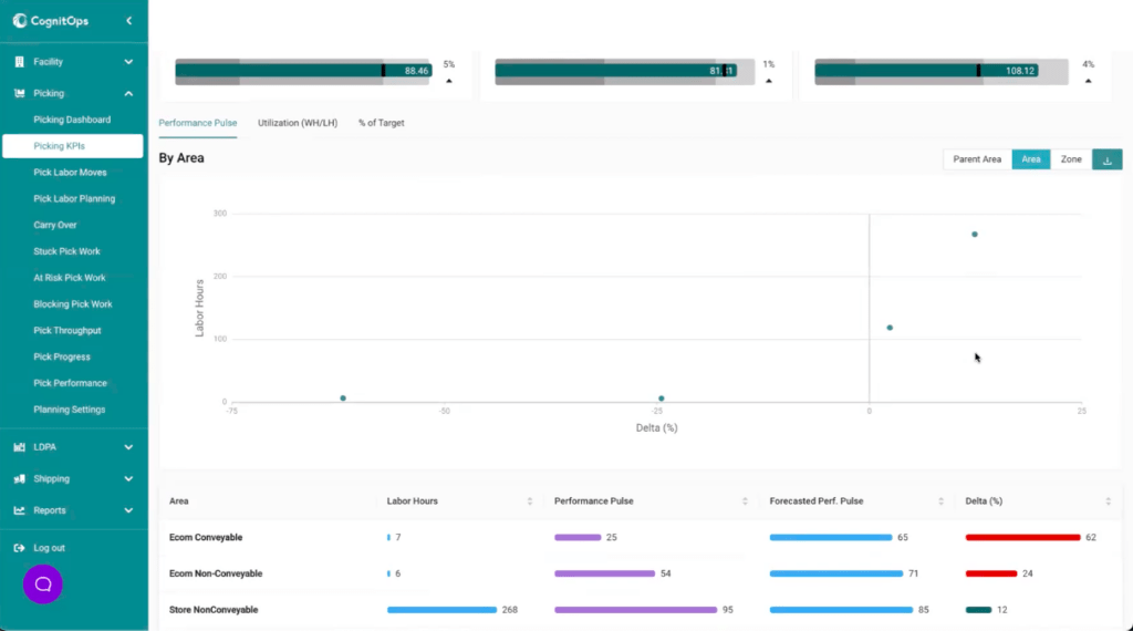
Performance Pulse by Area
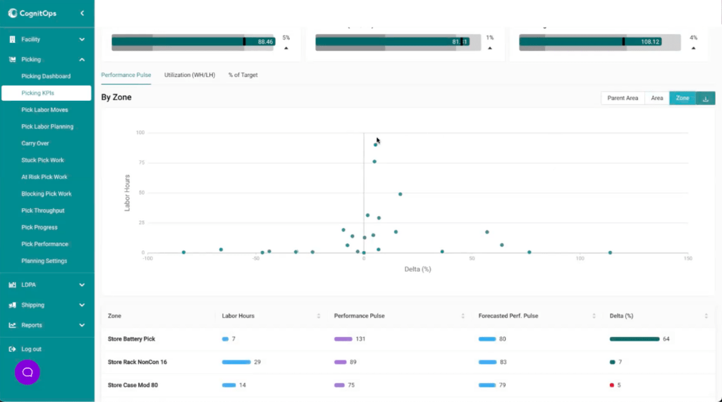
Performance Pulse by Zone
Picking Dashboard
The CognitOps Align Picking dashboard provides a one-stop shop for warehouse and facility supervisors to get a sense of what’s happening in this function over the course of the day. We brought the Picking KPIs, including Performance Pulse, to this dashboard as well so that leaders can get a quick view of how the team is performing as the day progresses. They can see how much work they have, the completion percentage, details on overall throughput compared to what they expect, where the work is, and more. It’s an easy view into whether everything is flowing smoothly, whether any red flags need to be investigated, and who supervisors need to talk to.
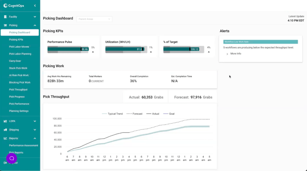
Picking Dashboard
Coming Soon
Coming next, we plan to bring Productivity up to the Picking KPI view to provide visibility to productivity and performance changes based on the mix of work that is upcoming. As an example a supervisor may assume the team is going to pick 150 grabs per hour based on historical performance, but if a bunch of a specific type of work is dropped, they could suddenly have way more hours in a slow-moving area than normal. That’s going to degrade their performance. This metric will not only look at the expected performance based on information we have at the beginning of the day, but also how that performance is expected to change based on the mix of work that is coming into the building throughout the day.

Author: Reas Macken Co-founder, COO & Head of Product
Get the latest news and updates.
Contact us to discuss how this kind of labor visibility can keep you on track…